Point Nepean Quarantine Station
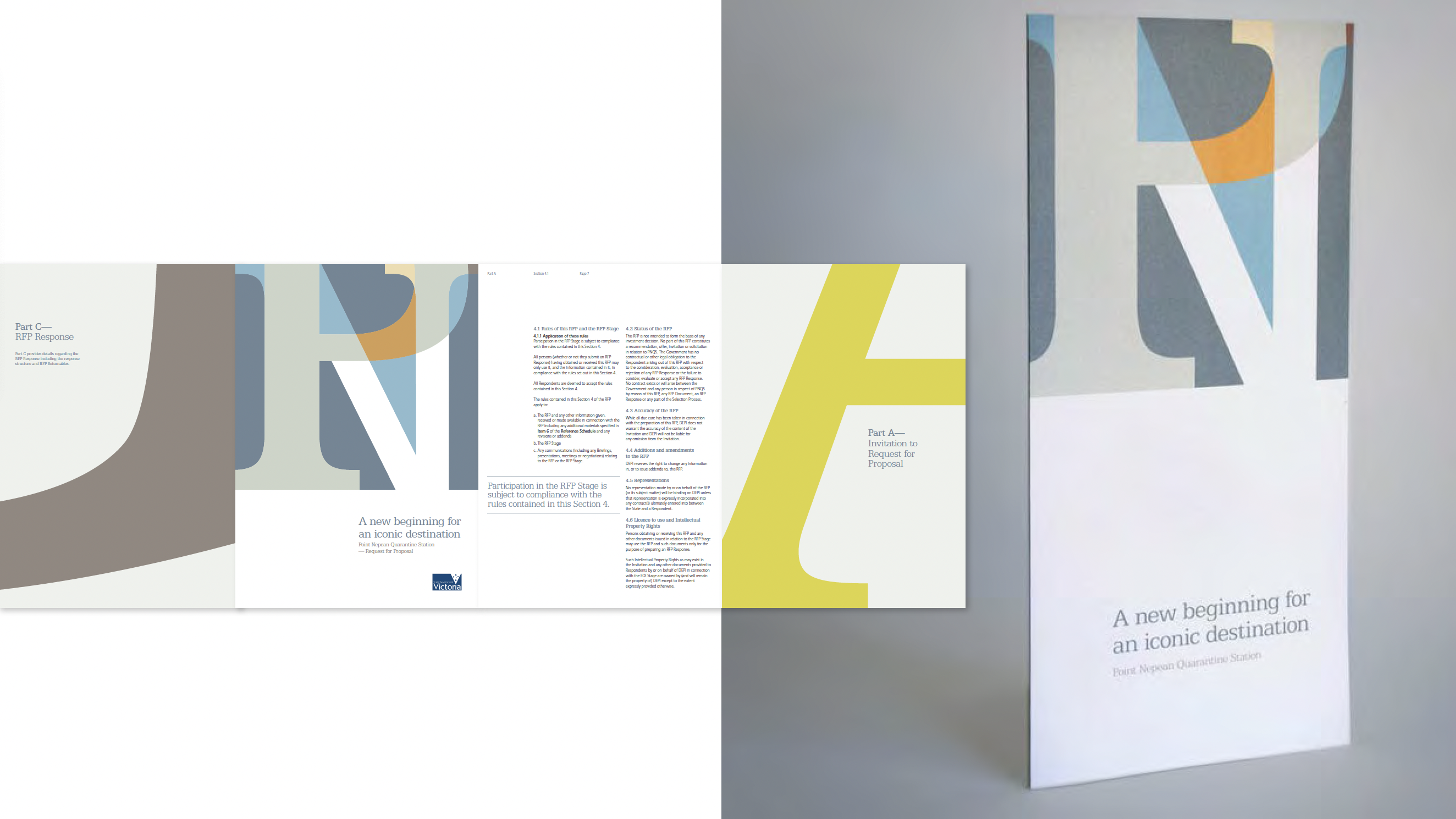
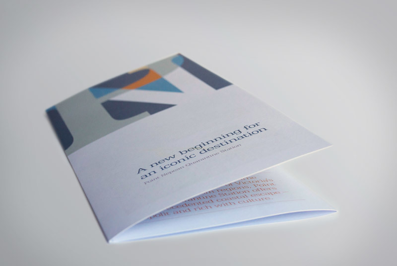
The special site of Point Nepean – Quarantine Station, Victoria is open for tender by the Victorian Government. Tasked to create a visual identity for a brochure that not only represents the new site, but also attracts high-profile investors. The visual is made up of the initial of Point Nepean. The overlaping of the letters P and N are segmented to represent the nooks and crannies of the historical site. The neutral colour tones used are a reflection of its surrounding, and are named as such; Sandstone, Ocean and Sky. A style guide and template were also produced for the client.
Tasks
Visual identity
Brand guideline
Print design
Microsoft Office templates
Toolbox
Adobe Creative Cloud
Microsoft Office